

How to Fix Gray Placeholder Text in Your Showit Contact Form
Why is my form text gray when I want it black?!
If you’ve found yourself shouting this at your laptop after spending way too many hours trying to find a fix, you’re not alone…
Inside the Showit Designer’s Hub, I noticed many designers running into this problem:
“The text in my forms is showing up gray, but I want it to be black. I’ve checked all my styling, and it still looks gray on the live site!”
Or:
“I wasted so much time trying to fix this — I even started embedding my own custom HTML forms just to get control over it!”
If you’re in the same boat, I’ve got the fix you’ve been looking for!
First, let’s talk about placeholder text
If you’re here, you probably already know what placeholder text is.
But if you don’t, it’s those little hints that show up inside your form fields before anyone starts typing. Things like “Enter your full name”, “Type your message here”, etc. — that’s called placeholder text.
By default, Showit styles this placeholder text in a lighter color. So, even if you set it to the purest black in the Showit design app, the placeholder text will show up on site as gray… unless you specifically tell it otherwise.
Why change placeholder text color?
Well there’s a few reasons. Sometimes it’s just for the aesthetic but a big one is accessibility.
Lightened text can be hard to read, especially on bright backgrounds if there’s not enough contrast.
You want the text to be as as easy to see as possible so people actually fill out your forms. You don’t want to accidentally discourage anyone from reaching out, especially if they have low vision.
The Quick Fix (sorted in seconds)
Whatever reason you want to change the placeholder text color, here’s the exact CSS code snippet you need to use:
/* Placeholder text styling */
input::placeholder,
textarea::placeholder {
color: #000000 !important;
opacity: 1 !important;
}
How it works:
- ::placeholder targets only the placeholder text in your form fields.
- color: #000000 makes it solid black (swap this out for any hex code your heart desires).
- opacity: 1 ensures it’s fully opaque (no more faded ghost text!)
- !important makes sure your code overrides all the default styles behind the scenes.
How to add the CSS code into Showit
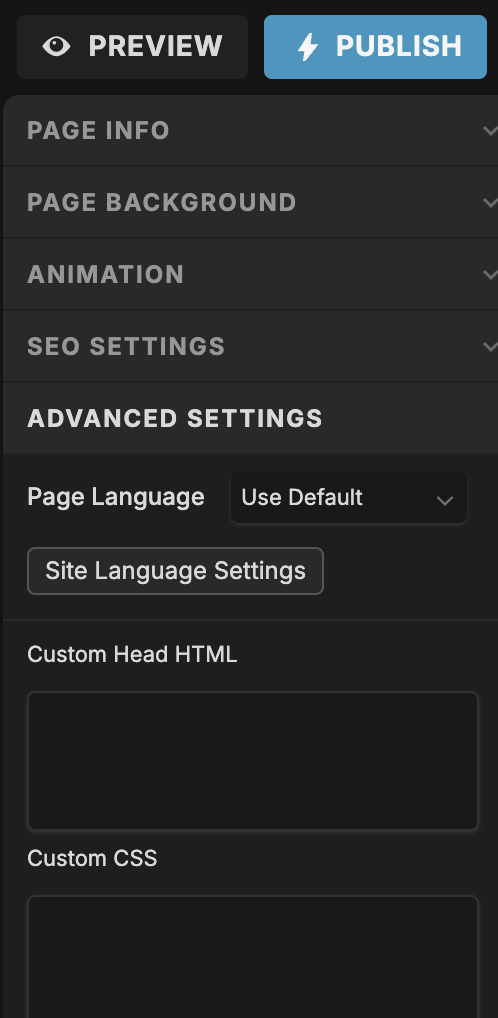
It’s easy, here’s how:
- Open the Showit app and click on the page with your form.
- On the right-hand panel, click Advanced Settings.
- Click into Custom CSS, then paste the code snippet in.
- Hit Save & Publish
That’s it! Your placeholders will now show up in the color you set instead of a lightened color. 🎉
Final thoughts
If you’ve been pulling your hair out over this, I’ve got you.
This quick CSS snippet will save you so many headaches and help you create a form that’s on-brand and accessible, always.
Need help customizing your Showit site further? Check out some more Showit tips here, or slide into my inbox with your questions anytime. I’m here to help! 🌹
blog

")