Here’s my step-by-step guide on how to create an animated sliding photo gallery with alternating text in Showit, as shown below.
Have fun and get creative with no coding required. Yes, really!
This gallery is created using the following built-in tools in Showit: Slider gallery, canvas views, shapes, text and icons. It can be created in less than ten minutes and as I say – No. Coding. Necessary. Phew!
Please follow the instructions below:
1. Create a blank canvas.
- Log into your Showit account.
- Click into the page you want to add the gallery to.
- Create a blank canvas.
- On the left panel, drag and position the canvas where you want it to display on the page.
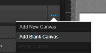
2. Insert a new gallery.
- Add a new gallery into your canvas
- Adjust the gallery size and position as desired for mobile and desktop.
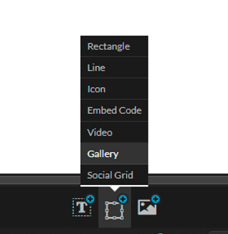
If you’d like the gallery to stretch across the web page, follow these steps:
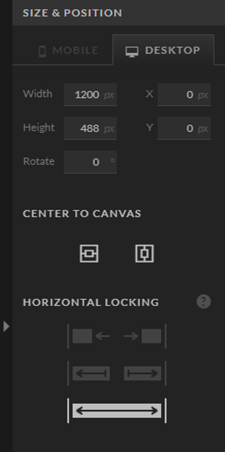
- Select gallery and click into Size and Position tab on the right-side panel.
- Set Gallery width to 1200px on desktop and 320px on mobile.
- Under Horizontal Locking, select the stretch icon shown below.
3. Add photos to your gallery.
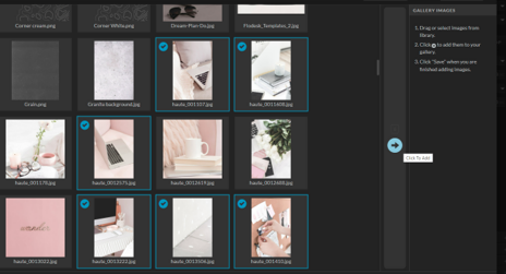
- Double-click the gallery.
- Select photos you want to add (hold down CTRL/Command to select multiple images).
- Click the blue arrow to add into gallery.
- Click Save to update.
Tip: For the best look, make sure photos are the same size and orientation before uploading to your media library / adding to gallery.
4. Adjust gallery settings.
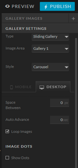
- In gallery settings (right side panel), add the following settings:
- TYPE: Sliding Gallery
- STYLE: Carousel
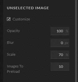
- Under UNSELECTED IMAGE, tick ‘Customize’
- Adjust scale and appearance of unselected images as desired.
Below are the settings used in my example (https://northrosestudio.com/test).
- Opacity: 100%
- Blur: 0
- Scale 70px
- Images to Preload: 10
5. Create transparent rectangle overlay
With the sliding gallery in Showit, it allows users to click and drag on photos to transition/slide through the gallery. Though this is a great feature, it doesn’t work for the sliding gallery we are making today. This is why we need to create a transparent rectangle overlay to act as a ‘blocker’.
Here’s how –
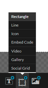
- Insert a rectangle shape into your canvas
- Set opacity to 0% for desktop and mobile.
- Resize shape so that it is covering the full gallery on desktop and mobile.
- On the left panel, make sure the shape is on top of the gallery.
6. Add navigation icons/arrows.
- Insert an icon.
- Choose an arrow from the icon list.
- Adjust size and color of the icon for mobile and desktop.
- Duplicate icon and rotate so the second arrow is facing left.
- Position one arrow to the left of your gallery. And the other to the right of the gallery.
- Adjust design on mobile and desktop.
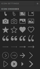
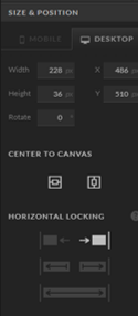
If you’d like your navigation icons ‘locked’ to the edge of the screen (as shown in my example), follow these steps:
- Select icon
- Click the ‘Size and Position’ tab on the right-side panel.
- Under Horizontal Locking, select the appropriate locking position.
7. Set navigation links.
- Set the left icon to link to Canvas View > This Canvas > Previous.
- Add click action – Type: Gallery (number). Gallery: (select gallery number). Target: Action: Previous.
- Repeat steps 6 & 7 for the right arrow but select Next instead of Previous.
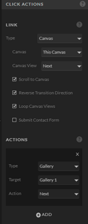
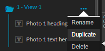
8. Setup canvas view 1 and duplicate.
- Add new canvas view (view 1).
- Insert textbox (or textboxes if more than one).
- Add in some placeholder text.
- Position textbox on canvas, and update design as desired for desktop & mobile.
*You can get as creative as you want here. You’re not limited to just text, you can add images, icons, shapes, videos etc. Basically anything you want to display underneath the gallery when the photos are in view can be inserted here. And you can design the canvas however you like. Just make sure every element you add is stacked under View 1 in the canvas (on left side panel).
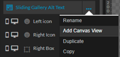
Once you’re happy with design of view 1, duplicate it so you have the same number of canvas views as photos in your gallery. (i.e. If you have ten photos in the gallery, you should have ten canvas views set up.)
9. Populate content for all canvas views.
Once all views are in place, go through each view separately and update the content to correlate with each photo in the gallery. When adding text, check the desktop and mobile design to make sure it fits in the textbox. If it doesn’t, adjust the textbox size/layout as needed.
10. Test & Publish!
Once all views are populated, click Preview to test your gallery! Don’t forget to test on desktop and mobile.
- If it’s working correctly, hit Publish and you’re done!
- If it’s not working, go through these instructions again and tweak your design and set-up as needed.

Need some support or have any questions? I’m here to help you out! Drop me a message in the chat (bottom right), or send an email to hello@northrosestudio.com. I aim to respond within 1 business day, though if I’m online my reply may be instant! 🙂
Prefer to skip the DIY? Hire me to add this feature to your website instead. Click here to book your project!
Good luck and happy creating!